If a picture is worth a thousand words, an app icon is a very special little picture worth a thousand clicks, maybe more if you design your app icon right.
App store discovery is responsible for 70% of app downloads. Clearly, you need to position your app front and center on the app store to garner maximum downloads and make sure your app gets noticed by all the right users. Designing the right app icon is the perfect way to achieve maximum visibility on app stores as well as motivate users to download your app.
There are millions of apps on app stores collectively – 1.85 million on App Store and 2.56 million on Playstore. This obviously means that for every given keyword a user searches for, there are multiple apps that offer similar services. When the app store returns a dozen results for a search term, the first thing that users notice is your app icon. They look for certain qualities in an app icon and the ones that have these qualities automatically become the first ones to get downloaded.
What are these qualities that make good app icons stand out from the crowd and drown out the competition? How to make an app icon stand out? That’s exactly what this post is all about. You will find out how to make an app icon so compelling that your users come clicking at first sight. Knowing the simple yet effective principles to app design icons can enable you to work closely with your designers for perfect results. In fact, you could even learn how to make your own app icons and best express yourself and your app in the app stores.
Why is app icon design so important?
Developing a mobile app that users would download on their phones involves a number of steps done right. You need a good quality app that performs, looks good, has the right app name, description and of course, the perfect app icon.
Of all these, having the right app design icon is undoubtedly the first impression that you must get right. Your app icon must represent your app as a whole. In fact, it must show your brand image as a whole, so the users know that they want to be associated with a company like yours. Research proves that 92.6% of all people surveyed agree that they tend to put most importance on visual factors when making a purchase decision. That statistic alone makes knowing how to make an app icon more compelling so much more important.
The aesthetic quality of your app icon shows the user what they can expect from the app as well as from your brand. It forms the groundwork for user engagement and is the first step to forming user perception. That is why app design icon is such an indispensable and critical step in your app development process.
After all, apps are unlimited and users are spoilt for choice. Users’ attention spans and storage on phones however, are limited. In 2020, the average number of apps a user had on a smartphone was 40 apps. However, 89% of time was spent in just 18 apps. For your app to be one of those 18, you need a striking app icon that’s irresistible.
How to make an app icon irresistible?
Now that you know just how important it is to get your app icon just right, you want to know how to accomplish this. That little picture measuring hardly a few pixels, can sometimes prove harder that developing the entire app. And why not? This little stamp sized picture needs to be everything – clean and simple yet representative for everything your app can do.
That’s a tall order and getting it right requires a careful balance of all of the principles we are about to discuss below. Once you understand all the essential qualities that an app icon must have, and everything that it shouldn’t, you can reimagine your app design icon and try to incorporate as many of these principles as possible.
-
Keep it Simple
First things first – steer clear of clutter. Do not overload your app icon with too much color, too many graphics, details or any other kind of color. When thinking about how to make an app icon, think simple colors, maybe two or three and no more.
Keeping your color palette minimal helps your app icon stand out from the rest as they portray a distinct form and design, instead of blending in with other multicolour icons. They send a clear message that your app is one of a kind, classy and sophisticated.
Think of app icons from any of the leading apps – Snapchat, Facebook, Spotify, Gmail or more – and you’ll notice a distinct color palette featuring no more than two colors. Clearly these apps know what they’re doing when it comes to app design icons and almost instantly answer the question how to make an app icon look signature.
![]()
-
Pick a Distinctive Shape
The secret to making minimal colors work lies in choosing a bold, unique and distinctive shape for your app icon. As with most of the above examples, app icons tie in closely with the company logo and if that’s already a distinctive logo, you are probably halfway through. Even if your logo is already made and rather complex, consider further simplifying it for the app icon.
A good app design icon has a clear, distinctive primary shape, ensconced in a simple square or circle. That unique shape is what imparts a strong sense of identity to an app icon. It tells your casual app store browsing users that here’s an app that knows what it’s doing, and has been built by people who are sure of their product as well as have a keen sense of modern design.
Also when thinking how to make an app icon look customized, consider choosing a shape that showcases what your app does. This not only helps users understand what your app is all about but also gives your app icon more credibility and sense of purpose.
The Spotify app icon once again aces this department as its black curves immediately give a sense of raising the volume which makes you think there’s good music in here.
![]()
Similarly, the Gmail app icon easily depicts a mail envelope as well as the letter M for mail. Of course the new icon is a little different but it works because Gmail already achieved worldwide stardom by the time they launched this new app icon, and it still depicts M.
![]()
However, Facebook and Snapchat icons, among others, work just as well without resembling their app’s purpose, simply by being bold shapes that stand out from the crowd thanks to their bold design choices. So be sure to design your app icon with a unique shape.
-
Skip the Words
App store have ample assorted spaces to not only tell your app’s name but also include keywords in tagline and app description. So, try to refrain from using any words in your app icon. Not only do they add to visual clutter but also, they become impossible to read or discern. As a result, they add to cognitive load and eye strain, as the mind is conditioned to try to read when there’s text. Your users will likely feel exasperated trying to read the miniscule text.
So if you’re wondering how to make an app icon be an anchoring point for your app experience, focus on giving your app a compelling name and strictly keep that name in the app name section. Combined with a beautiful, simple, clean looking icon, that should do the trick.
-
Experiment with Borders
Sometimes an app icon does well with a border and sometimes without. You can test this out be designing different versions, with and without border, to see what works best for your app icon.
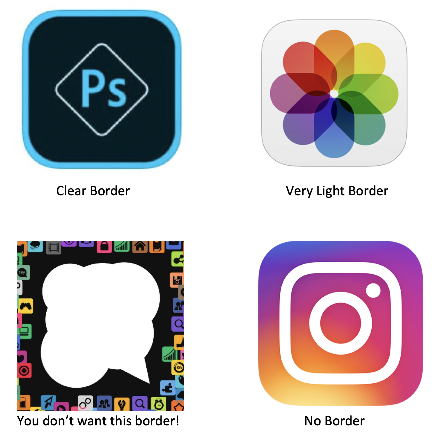
There are examples of leading apps designing app icons both ways. When considering how to make your own app icons look unique and distinctive, you need to consider what goes with the other elements of your app icon. Your primary app color, its shape and design are some of the things that will dictate whether you should or shouldn’t have a border.
-
Perform A/B Testing
Circle or square? Border or no border? Blue or red? Too many simple looking questions become surprisingly hard to answer when designing app icons. Take the guesswork out of it and rely on tangible solutions like A/B testing to determine what the best option to go with is.
![]()
When caught between 2 choices, A/B testing is the best way to determine what your users will prefer. Here’s a detailed tutorial on how to perform A/B testing for app icons on Playstore. To summarize the process though, you can do a beta launch of your app with both icons. Half your test users will view one icon and the other half will view the other icon. Testing tools will help you gather data on which icon received more pronounced attention, helping you understand which app icon is perfect for your app.
-
Stay Away from Clutter
Using photos in app icon, or a screen grab of the app, or an animated depiction of detailed app, or any kind of icon that involves too many elements is likely a put-off for your users. Be sure to keep your icons limited to a concise, clear and signature design. Any kind of clutter will make your app design icon look old, dated and turn your users away.
Try it for yourself – which o the following candy crush Icons look more appealing to you? There’s a reason why one of the world’s most crazily popular games went for the latter when designing their app icon.
So when deciding how to make your own app icon look sophisticated and modern, remember to keep things clean and clutter free to come off as a well-designed, sophisticated app.
-
Icon Making Apps
A number of icon making apps and template services are easily available today. You can choose to use one of these icon making apps if you really are willing to put in a lot of work into guiding them. However, if your app is a real business and not just a temporary pastime, it is always preferable to choose custom app icon design over icon making apps. Template based solutions from icon making apps are most likely to give you cookie cutter options and nothing signature can ever come out of those.
Consider the Snapchat icon or the Spotify icon. The carefully made icons with the signature ghostlike figure (Snapchat) or the volume rising figure (Spotify) would never have come out of template based icon making apps. Creating signature app icons is a creative process that only comes when the vision of your app aligns with the creative genius of a talented designer.
Conclusion
So the above pointers and examples are enough to give you a substantial idea of what makes app icons work. When you decide how to make your own app icon, these principles will help you understand the user mindset and design an app icon that users are most likely to click on. To summarize, app design icons must be clean, simple and clutter free. Try to keep your color palette restricted to 2-4 colors. In fat, a combination of 2 signature colors works best as seen in the icon making apps and most of the widely successful icons in app stores today. If you can manage to stick to these caveats, you can be sure you app icon will draw your users in and compel them to download and use your app.