Pattrn App
Water treatment services

Water treatment services
COLOUR AND TYPOGRAPHY
#03494D
#87ADBE
#FFB79D
Project





Project
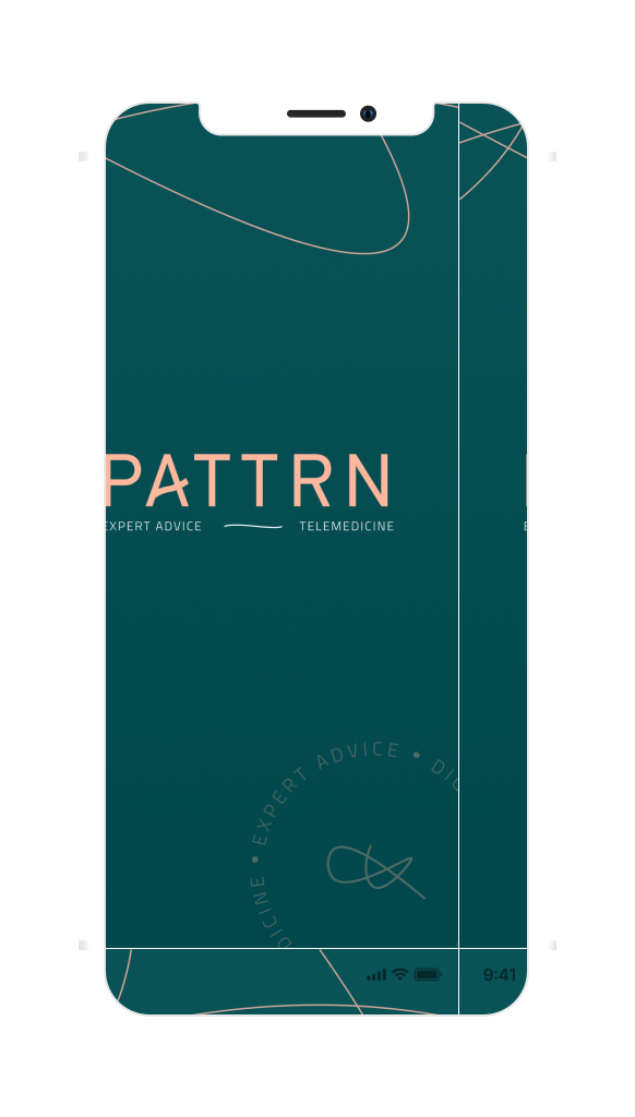
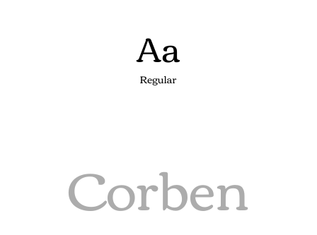
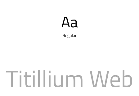
Developing an app like Pattrn comes with a unique set of challenges. It needs to have the trust, accuracy, and accountability of a m-health app, as well as the design and functionality of a lifestyle app. To achieve this, we chose a green palette that symbolizes health, growth, and harmony. The carefully designed interfaces, soothing transitions, and calming visuals complement the green palette and provide a sense of reassurance and confidence. The app's typography was chosen to be clear and easy to read, making it accessible to users of all ages.
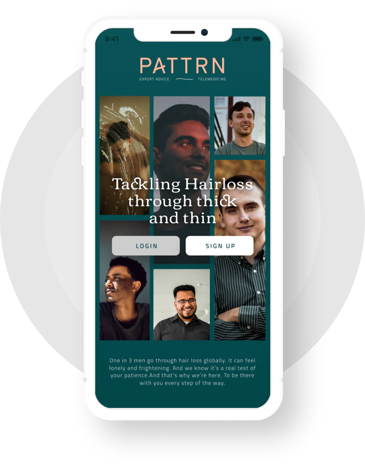
For personalized treatment designed by certified trichologists and tailored to the user plan sent directly to their phones via the app.
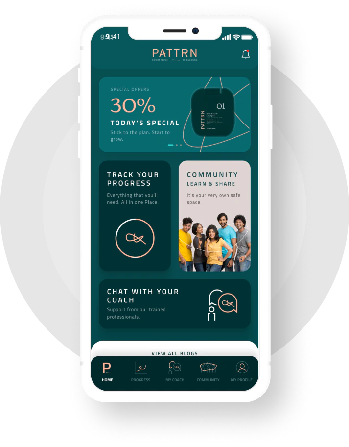
This is where users can see their treatment plan overview in a glance, and easily access their medication schedule, upcoming visits, and more.

Personalized coaching program helps users develop a healthy lifestyle supporting their treatment, through activities and lifestyle changes.
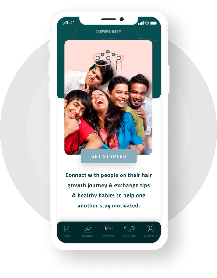
Connect with other Pattrn patients, share experiences and challenges with others who are going through a similar journey, providing moral support.