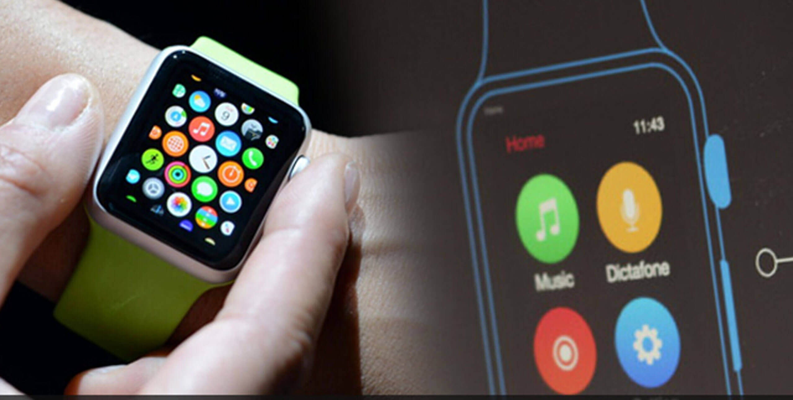
Apple Watch – the first wearable for Apple is a platform, for which a lot of developers want to create apps and be an early adopter. Easier said than done, although they do have WatchKit, the guidelines issued by the Cupertino based tech powerhouse are stringent.
Recently, the company submitted a new guideline (in the User Interface category of App Store review guidelines), according to which “Watch Apps whose primary function is telling time will be rejected”. This was from developers’ perspective. From designers’ point of view, there are a lot of points to consider, which are present in Apple’s Human Interface Guidelines. Let us take some essential cues from these guidelines for designing the best of applications for the Apple Watch.
Strike a Balance Between – Personal, Holistic and Lightweight
Striking a balance between personal, holistic and lightweight is a must.
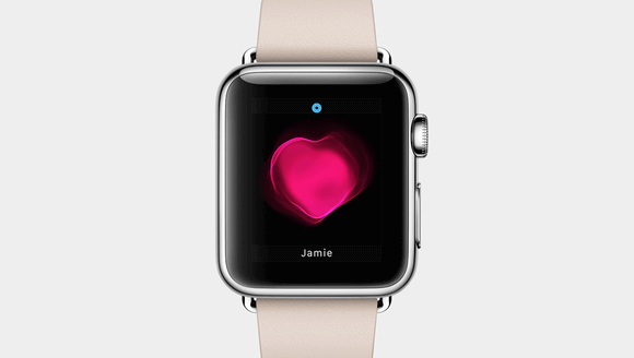
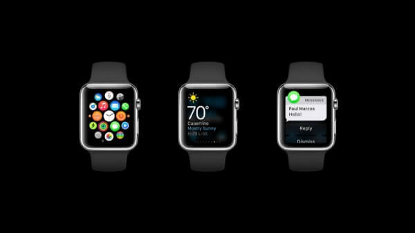
Made for the wrist, Apple Watch provides scope for personal communication. The wearable is closely related to IoT (Internet of Things) and hence, it blurs the boundaries between physical objects and software making it holistic. With its Taptic Engine and Haptic Feedback, the wearable allows physical feedback and alerts. For instance, users can record and send their heartbeat to their loved ones for a more intimate connection. Also, quick and lightweight interactions are the mainstays of the Apple Watch interface. Whether it is short-look notification providing minimal alert to the users or Glances – the brief and compact information fitted on the screen, the design of the app should ideally stick to the ‘keep it short and simple’ principle.
Simplify Navigation
The small screen real estate of the Apple Watch calls for simplified navigation.
The Apple WatchKit supports two navigation methods – Hierarchical and Page Based. Select the one relevant to your app for intuitive navigation.
The hierarchical style works best when you want to present hierarchical information in your app. It provides the users one choice per screen; they can continue navigating from one screen to another till they find what they are looking for. This navigation simplifies complex app interactions.
The page based style allows users to navigate between different pages of content in the app by swiping it horizontally. If you intend to design an app with simple data and each data is not linked directly to the data on other pages, skip this navigation style. The users’ place in the pages is indicated by a dot indicator at the bottom of each page. You can further simplify the navigation in your app by reducing the total number of pages.
Provide Multiple Scopes of User Interaction
Apple Watch provides immense scope of handy user interaction for app design.
The fact the user interactions are completely different in an Apple Watch, you need to take into consideration them as well when you are all set to design an app. Here are some points that you need to remember:
• The Apple Watch does not support pinches or any other multifinger gestures.
• Apart from sensing touch, the Retina display on the smartwatch detects the amount of force applied by the users’ fingers. This functionality is called Force Touch. Use this for contextual menus.
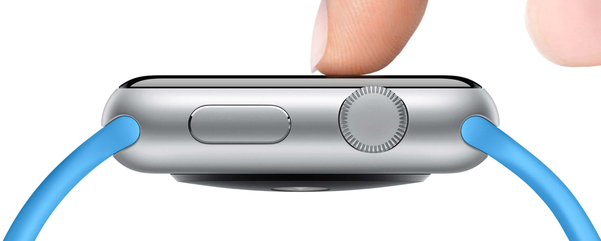
• The Digital Crown in the Apple Watch hardware allows finely tuned and accelerated scrolling for longer pages.
Use them to provide multiple scopes of user interaction in your app.
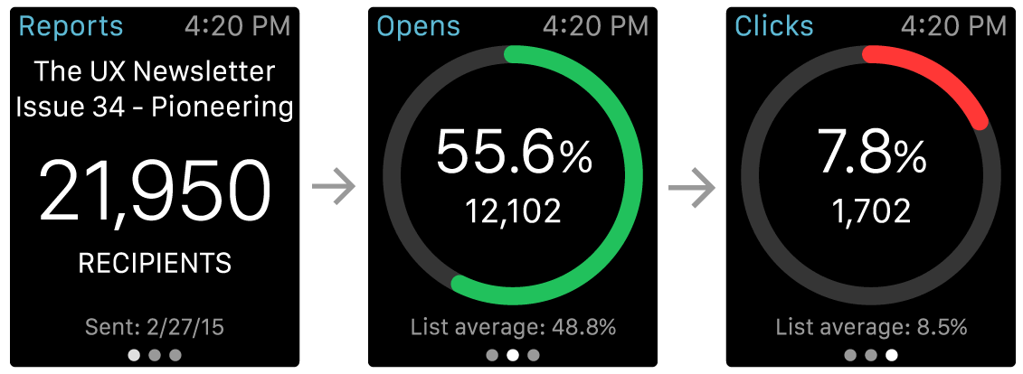
Glances are Optional but Highly Useful
Glances although optional, are highly useful to display content in compact form to users.
Glances offer a quick view of your app’s essential content to the users. Because they are template based and not scrollable, the content in your app’s Glances needs to fit the screen and be associated with a single action at a given time. The area at the bottom of each Glance in an app has page indicator dots. However, not all apps need glances. But if you want to use them specifically in an app, make sure that they provide useful data to end-users.
Know Which Notifications to Use
Select from Short Look and Long Look notifications depending upon the app.
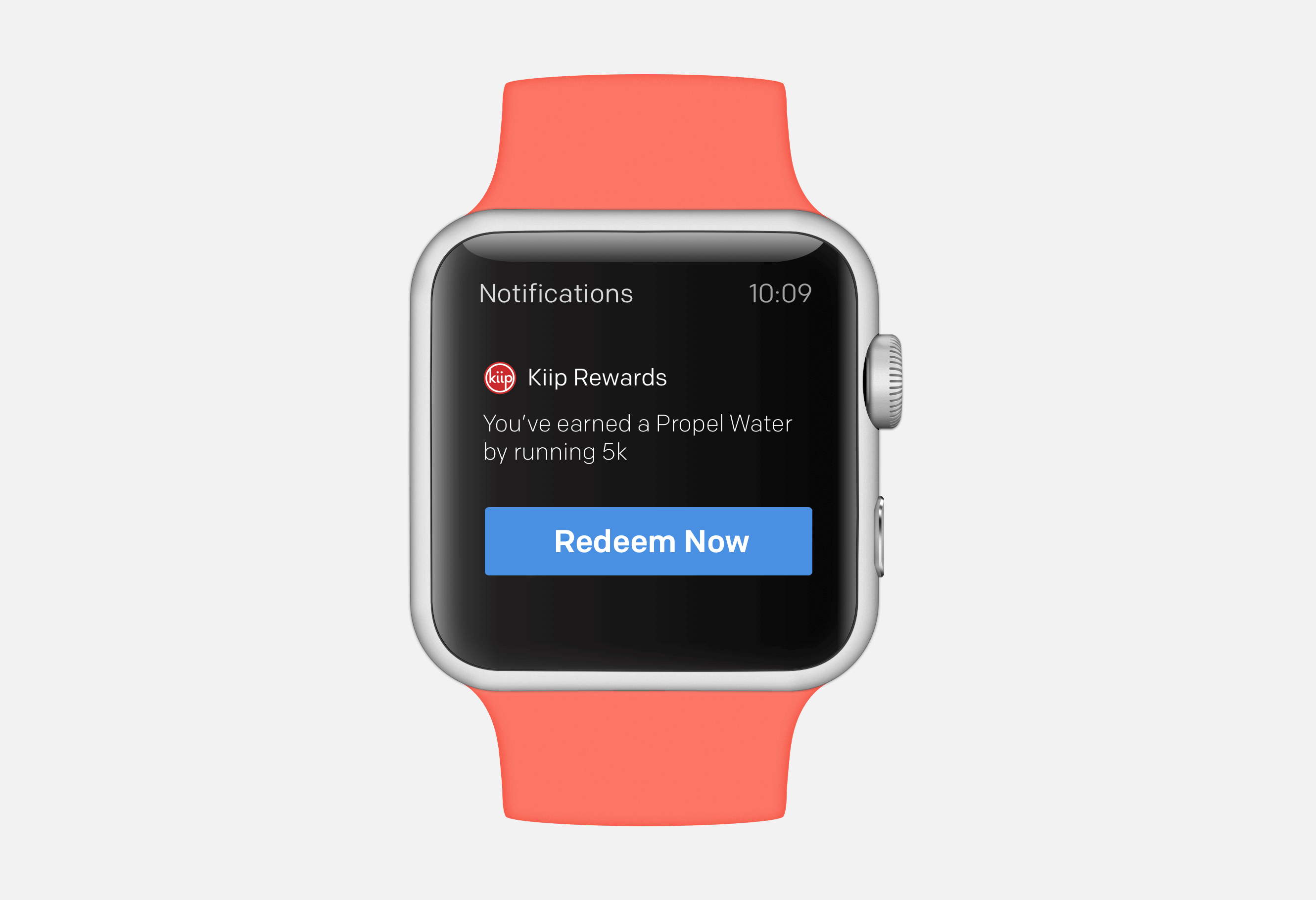
Apple offers two Notifications on the Apple Watch – Short Look and Long Look. The Short Look notification provides minimal information, visible to users for a brief time and includes an app icon, title string and the app’s name. The Long Look is activated from Short Look when users keep their wrists raised up when the Short Look notification comes in or when they tap on it. Along with the Dismiss button, Long Look notifications are actionable and may have up to four different types of app-defined actions.
Make Best Use of the Device Bezel
The Device Bezel on Apple Watch lets you use full screen width.
The Device Bezel of the Apple Watch eliminates the need of margins or additional white space in an app. Hence, make sure that all elements in the app have sufficient room to expand and display the content completely. Left alignment is always a good option for designing apps specifically for the bezel.
While designing the layout, prefer icons instead of text in buttons and place them side by side.
However, don’t place more than three items together – side by side at a time; doing this will make the tap targets way to small and inconvenient for the user. If you don’t have any other option but using text buttons, ensure that the buttons are of the full width and clearly visible to users. Additionally, when you need to show actions that are not important, settle for contextual menus.
These are just a handful of ways through which you can make the best use of the device bezel of the Apple Watch.
Settle for Black as Background Color
Apple makes it mandatory to use black as the background color for all Apple Watch apps.
Apple is also stringent about the use of color on its Apple Watch apps and makes black background color a compulsory trait for all the apps developed for the platform. The underlying reason is again, the device bezel; a black background will give an impression of no screen edges by blending perfectly with the device bezel. Also, you need to make the text in your app more legible by using high contrast colors for text in the app.
To Conclude
These are some of the main things that you need to take into consideration while designing an application for the Apple Watch. Apart from these points, you also need to include dynamic animations in your app and make the experience more engaging for your end-users. Additionally, the icons for the Apple Watch apps have to be designed as per Apple’s specifications. I am sure that by using these essential pointers, you will be able to create engaging, user-friendly app for the Apple Watch. If you too have some tips that you want to share with us, feel free to do so via your comments.
( Image Source – 1 , 2 , 3 , 4 , 5 , 6 , 7 )
Read also:Creating a 3D Touch App – Opening New Frontiers for iOS App Developers